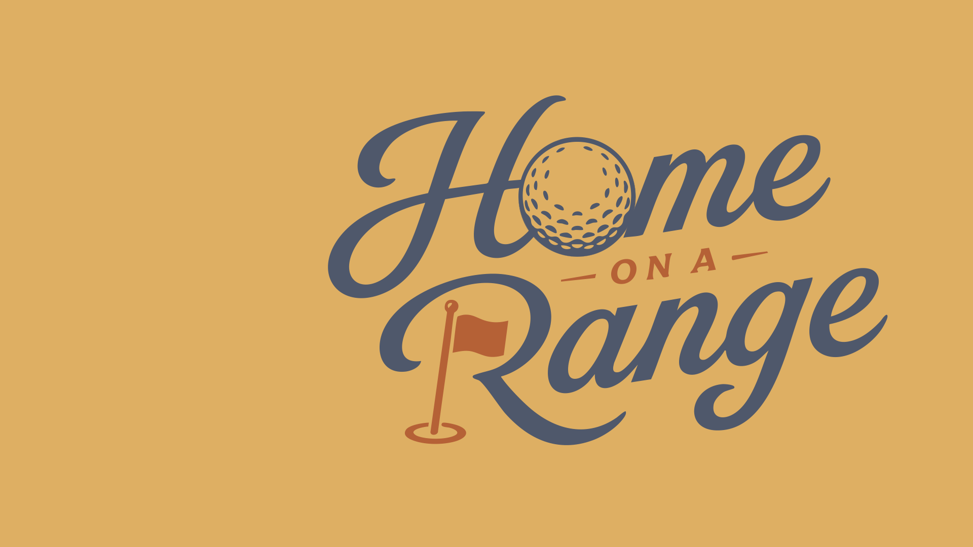
Golf culture has no shortage of polished country club brands and high-energy apparel companies. Home on a Range needed to occupy a different space—one shaped by Kansas landscapes, rural character, vintage Americana and a genuine love of the game.
What began as a passion project centered on reviewing golf courses was growing into something much larger: a lifestyle brand with opportunities across apparel, social content, tournaments, mobile putt-putt, golf simulator experiences and other event-based activations.
The challenge was to develop a visual identity that could support that growth without losing the authenticity that made the idea distinctive.
The Brand Challenge
Home on a Range needed to feel connected to its Midwestern roots without becoming overly western, rustic or predictable.
The brand had to balance several qualities at once:
- Regional, but capable of reaching a broader audience
- Premium, but never overly formal
- Nostalgic, but still relevant to modern golf culture
- Playful, but credible enough to support apparel and merchandise
- Distinctive, but flexible enough to work across many applications
The original project direction called for an identity that could live comfortably on everything from a golf polo and vintage-inspired T-shirt to a tournament activation, golf towel or social media post.
Rather than imitating established golf lifestyle brands, the goal was to create an ownable lane grounded in the landscapes, textures and personality of the Great Plains.
Finding the Creative Direction
The discovery phase explored the visual territory surrounding Home on a Range: Kansas sunsets, prairie landscapes, rural golf culture, Americana typography, vintage roadside graphics and the slightly irreverent personality found in modern lifestyle brands.
The most successful direction was not traditional “country western,” nor was it conventional country club golf. It lived somewhere between the two.
The resulting brand personality was:
Confident. Welcoming. Nostalgic. Premium. Unpretentious.
That positioning became the filter for every visual decision. Each element needed to feel considered, but not precious. Familiar, but not generic. Connected to place, but not limited by it.
Designing a Flexible Logo System
A lifestyle brand rarely relies on one logo alone. Home on a Range needed a family of marks that could adapt to merchandise, embroidery, digital media, event signage and smaller branded items.
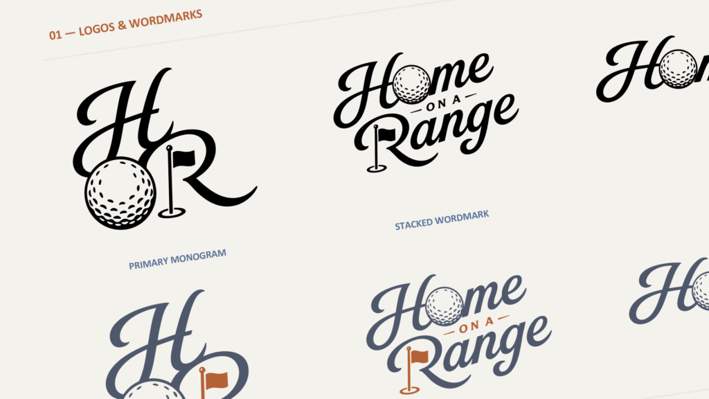
The final identity includes three primary configurations:
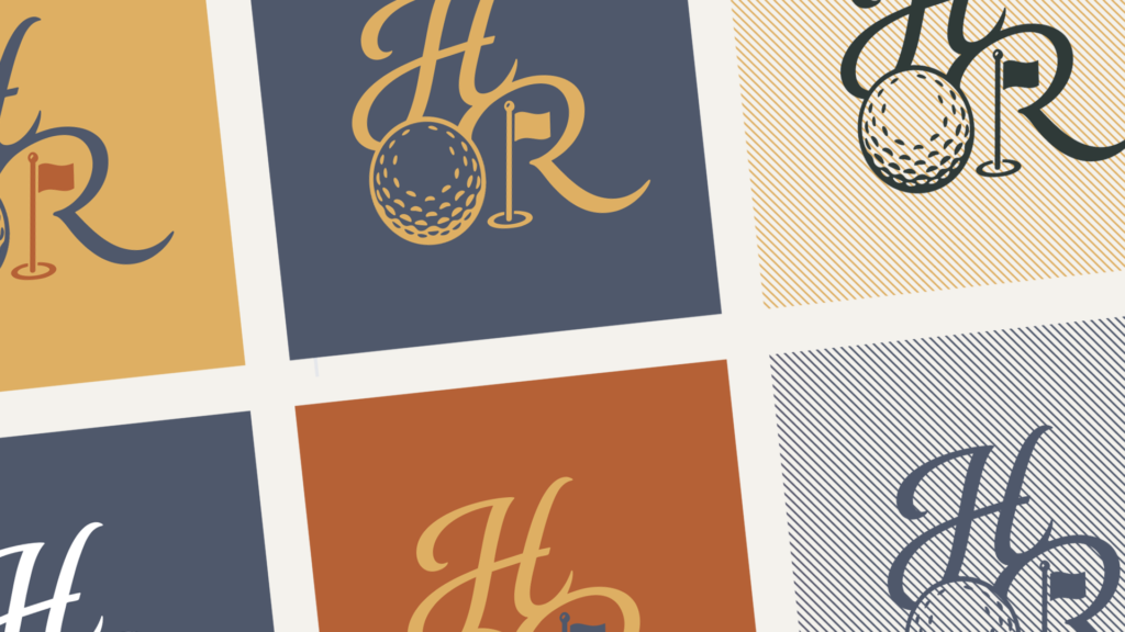
- A compact HR monogram
- A stacked Home on a Range wordmark
- A horizontal wordmark
The golf ball and flag became the defining visual elements across the system. The ball is integrated into the lettering rather than added as decoration, while the flag provides an immediate golf reference and gives the identity a distinctive silhouette.
Together, the three configurations allow the brand to remain recognizable whether it appears as a small embroidered chest mark, a full apparel graphic or a wide digital header. The completed standards document presents the monogram, stacked wordmark and horizontal wordmark in coordinated black-and-white and color variations.
A Palette Inspired by the Plains
The color system draws from the landscape rather than relying on the bright greens and primary colors commonly associated with golf.
Terracotta, golden ochre and warm taupe reference prairie grasses, soil, leather and late-day sunlight. Slate blue and charcoal green provide a grounded foundation, while dusty plum adds an unexpected layer of character.
The approved palette includes:
- Terracotta
- Golden Ochre
- Warm Taupe
- Slate Blue
- Charcoal Green
- Dusty Plum
These colors give the identity warmth and regional personality while remaining sophisticated enough for apparel and lifestyle products.
Subtle textural patterns add another reference to vintage printmaking, well-worn materials and classic Americana. Used carefully, they help the brand feel established rather than newly manufactured.
Typography with Personality
Typography plays an important role in balancing nostalgia and modern usability.
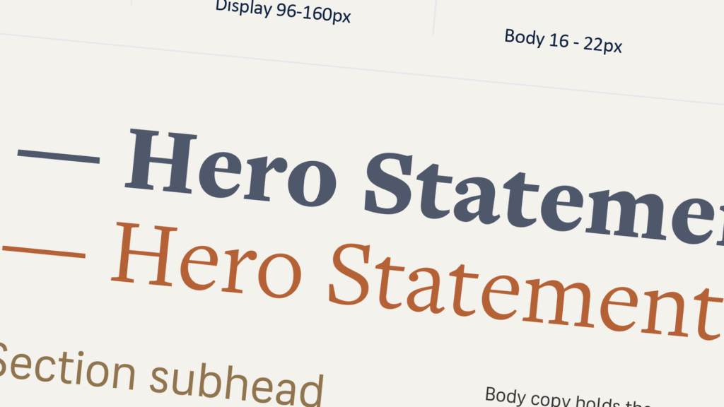
Expressive serif typography gives the brand its headline voice, while a clean supporting typeface keeps body copy clear and functional. The system is designed around short, declarative language—direct enough to be read quickly, but still rich in personality.
That voice comes through in lines such as:
Long days.
Good putts.
Better company.
The statement captures what Home on a Range is ultimately about. Golf is part of the experience, but the larger story is about place, time spent outside and the people who make a round memorable. The visual-language page of the standards pairs this message with the logo, prairie imagery, golf icons and multiple color treatments.
Designing for the Real World
A brand identity is only successful when it works beyond the presentation deck.
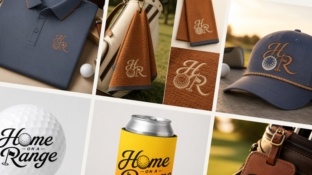
Throughout the process, the logo system was evaluated across applications such as polos, hats, golf towels, golf balls, koozies and leather bag tags. These mockups helped test scale, legibility, embroidery potential and the personality of each logo configuration.
The compact monogram works especially well for hats, polos and towels, while the stacked wordmark creates a stronger statement on golf balls, drinkware and leather accessories. The merchandise examples on page five of the standards demonstrate how the system can shift between understated premium applications and more playful lifestyle pieces without losing consistency.
This flexibility creates room for Home on a Range to grow into future collections, events and branded experiences while maintaining a cohesive identity.
More Than a Golf Logo
Home on a Range was never intended to be simply another golf logo.
It was an opportunity to build a visual world around a specific point of view: golf experienced through the character of the Great Plains. The final identity brings together regional storytelling, modern merchandise sensibility and a sense of nostalgia without leaning too heavily on any one of them.
The result is a brand that feels equally at home on the course, on the road or gathered with friends at the end of a long day.
Home on a Range is rooted in Kansas, inspired by golf and designed to go wherever the game leads next.
Visit homeonarange.golf to learn more about Home on a Range.
JBerra Consulting
Building a brand that needs room to grow?
I help businesses turn strong ideas into thoughtful, flexible brand systems built for the real world—from identity and messaging to websites, campaigns and everything in between.
Let’s build something that feels like you—and works wherever your brand goes next.
Start a Conversation
Leave a Reply