Building a brand that feels as thoughtful as the work behind it
Some projects are about design.
Others are about alignment.
My work with Strategic Wealth Coaching became both.
A Different Kind of Financial Brand
From the start, this wasn’t about creating a brand that looked like wealth management.
It was about creating one that felt different.
More human.
More intentional.
More aligned with how people actually want to think about money and life.
Because today’s clients aren’t just looking for performance.
They’re looking for partnership.
And that shift changes everything.
The Foundation: Strategy Before Design
Before anything visual came into play, we focused on clarity.
Who this brand is for.
What it stands for.
How it should feel to interact with.
The direction became clear:
- Calm, not cold
- Confident, not overwhelming
- Strategic, not transactional
That foundation guided every decision that followed.
Because when strategy is clear, design becomes intentional.
Building a System, Not Just a Brand
One of the most important parts of this project was building something that could scale beyond a single moment.
Not just a logo.
Not just a website.
A system.
That included:
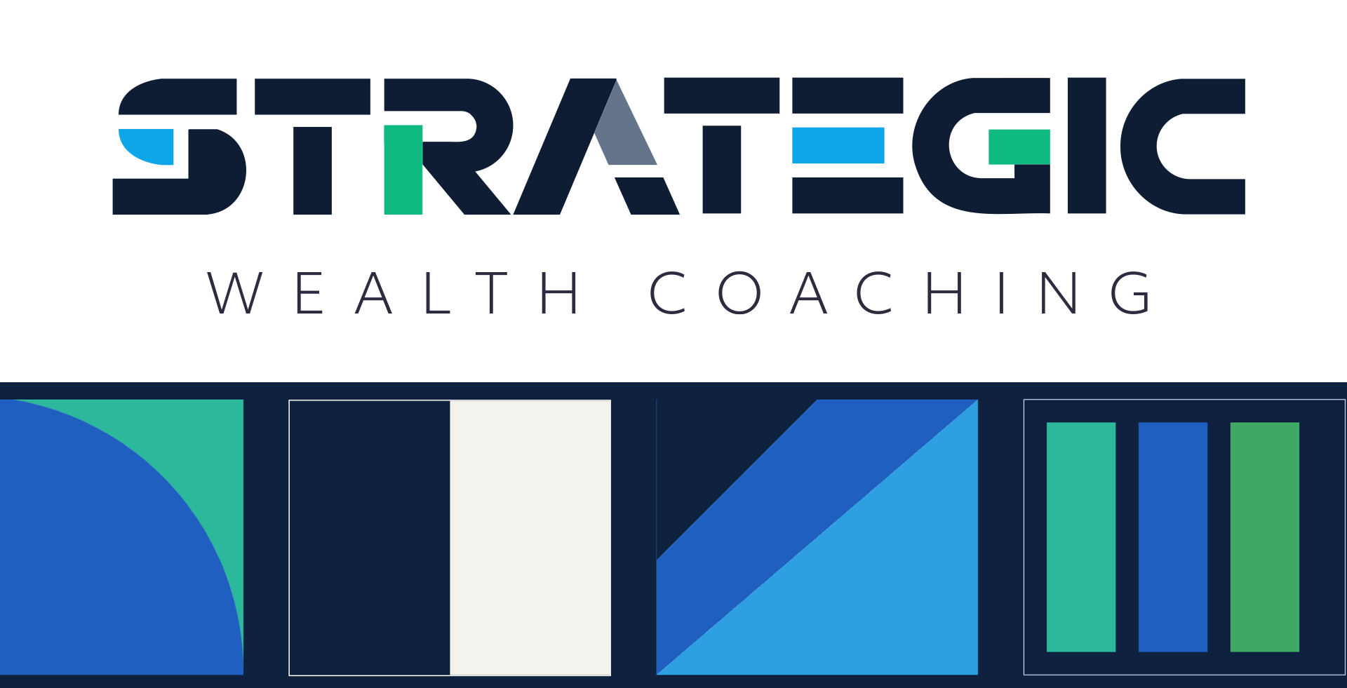
- A structured color palette anchored in contrast and clarity
- A typography system built for readability and hierarchy
- A visual language using geometric forms to create consistency
- A voice that feels like a trusted conversation—not a sales pitch
Everything needed to work together.
Because a brand doesn’t live in one place.
It lives everywhere.
Where Accessibility Becomes Part of the Strategy
Accessibility is often treated as an afterthought.
But in this project, it became part of the foundation.
Because if a brand is built on clarity and trust—
the experience has to support that.
That meant making intentional choices like:
- Using high-contrast color pairings so content is easy to read
- Designing typography for real-world use (not just aesthetics)
- Creating buttons and forms that feel simple and intuitive
- Making sure meaning isn’t communicated through color alone
These aren’t just technical decisions.
They’re human ones.
Because good design doesn’t make people work harder to understand you.
It makes things feel easier.
The Foundation: Strategy Before Design
Before anything visual came into play, we focused on clarity.
Who this brand is for.
What it stands for.
How it should feel to interact with.
But with a financial brand, there’s another layer that can’t be ignored:
compliance.
There’s a lot of back and forth.
A lot of required approvals.
A lot of structure that needs to be respected.
And if you jump straight into design without understanding that landscape, you end up reworking everything later.
So instead of rushing into visuals, we took the time to understand:
- What needs to be approved
- What language is required
- How disclosures need to show up
- What the platform constraints are
That level of preparedness changes the entire process.
It allows design to move forward with confidence—not friction.
The Balance: Expression vs. Experience
One of the most nuanced parts of this work was finding the balance between brand expression and usability.
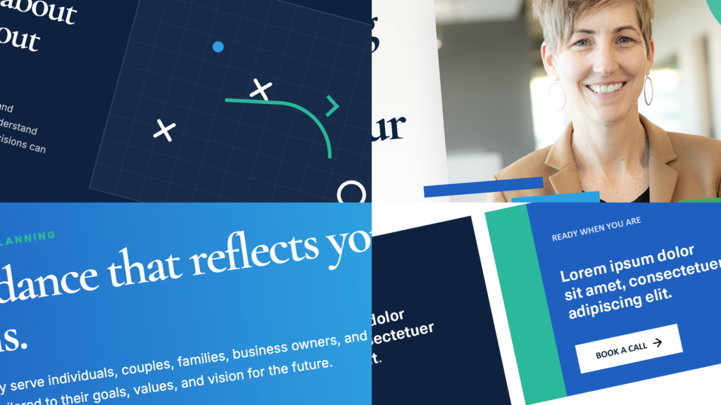
The visual identity is bold and geometric.
But the website experience?
It needed to feel calm, grounded, and clear.
So we made a shift:
- Bold colors became accents—not primary content
- Shapes became structure—not distraction
- Typography became the anchor
The result is a brand that feels distinct—without sacrificing clarity.
What This Work Really Does
At the end of the day, this isn’t just about design.
It’s about trust.
When someone lands on a website that is:
- Clear
- Consistent
- Easy to navigate
They don’t hesitate.
They don’t question.
They engage.
And that’s where real connection begins.
Why This Project Matters to Me
This is the kind of work I care about.
Not just making something look good—but making it work.
Not just creating a brand—but building a system behind it.
Projects where there’s intention behind every decision.
Because that’s where design actually makes an impact.
And when that impact helps support a female-led, LGBTQ+ inclusive financial firm that is committed to helping people build confidence in their future, the work becomes even more meaningful.
Building brands that reflect authenticity, trust, inclusion, and purpose is the kind of work I’m proud to be a part of.
Final Thought
If your brand looks good but doesn’t feel clear…
If your website exists but doesn’t convert…
If things feel harder than they should…
It’s usually not about doing more.
It’s about doing it with more intention.
Ready for more clarity?
Build a Brand That Works as Hard as You Do.
Whether you’re starting from scratch or refining what already exists, let’s create a brand, website, and message that reflects the quality of your work and connects with the people you want to reach.
Leave a Reply